
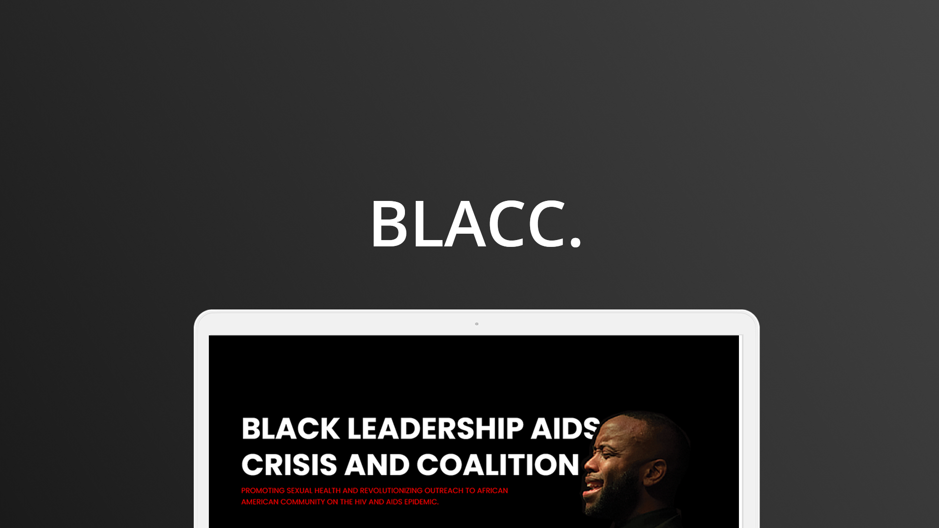
Black Leadership AIDS Crisis Coalition
Overview / 7min read
Project Duration
Sept 2019, 14 Days
My Role
Lead Designer / Full Stack Developer
Team
Gavin de Reuck
Associate Director, Digital Marketing
The Black Leadership AIDS Crisis Coalition (BLACC), formerly known as the AHF Black AIDS Crisis Task Force, is an initiative of the AIDS Healthcare Foundation (AHF) developed to create a coalition of African-American cultural influencers and health advocates who will promote sexual health and revolutionize outreach to the African-American community on the HIV/AIDS epidemic.
Adobe CS (Design & Prototype)
Pen & Paper (Sketching)
Google (Project Organization)
Interaction Design
Prototyping
Project Management
Key Skills
Idea
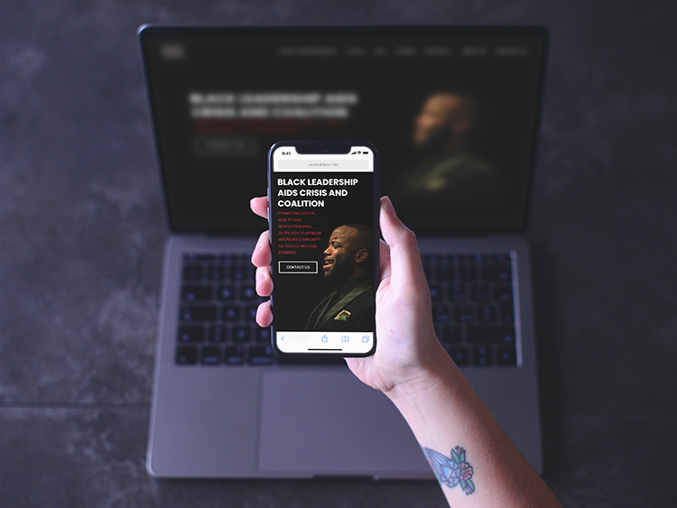
The re-design of the BLACC’s website will help people find the resources they need in a useful and welcoming way.
The Process
Research
Brand Definition
Affinity Mapping
High Fidelity Mockup
Develop (Staging in WordPress)
Success goals for BLACC
We directly adapted the current BLACC website and brand guideline that was provided. These goals helped us make design decisions quickly throughout the development cycle.
😎 Valuable: The website provides personalized, and actionable paths that connect people to volunteer and to see upcoming events.
👩🏫 Inclusive: The website is mainly focused on black minorities but also fully supportive of diverse cultures that has a similar interest.
🙏🏻 Encouraging: The website empowers and impresses users with a simple and smart design that is easy to navigate to each different sections.
⏱️ Efficient: The working prototype must be delivered on time.
Key research insight
”People do mind how the website looks after all.“
We focused on front-loading our generative research in the first day when the project was given: I facilitated all the important problem areas and after picking the direction, we interviewed two employees from Aids Healthcare Foundation on the view of the current BLACC website. We also collected opinions from different department who specialized in this affiliate group. Here are the insights we synthesized:
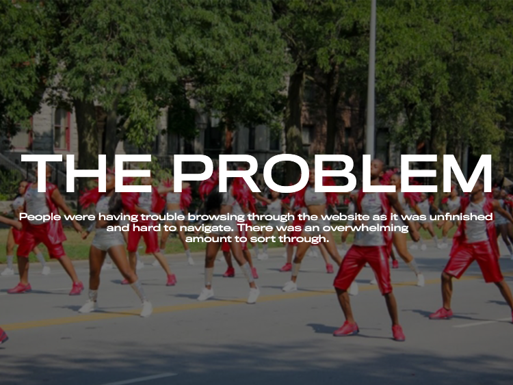
💬 The website is unfinished and it needs to be done where users can access certain area.💬 For shy or introverted people, it might be hard to go to events and may be very overwhelming. Why not try to make it friendly.💬 People who are already in groups make it difficult for individuals to feel involved. Information Architecture
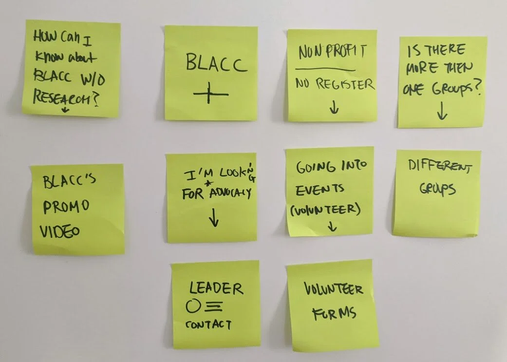
After card sorting I used the post-it to start organizing what the website should be and how it should be branded as well as a lucid chart which you can see below.
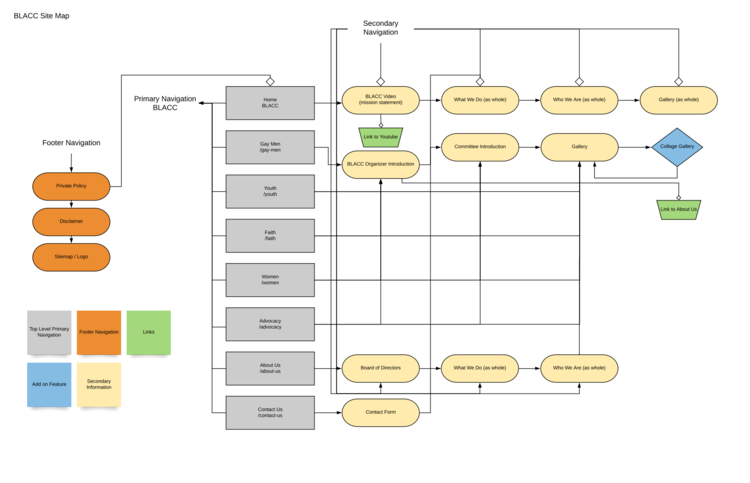
LOW Fidelity Mock-up
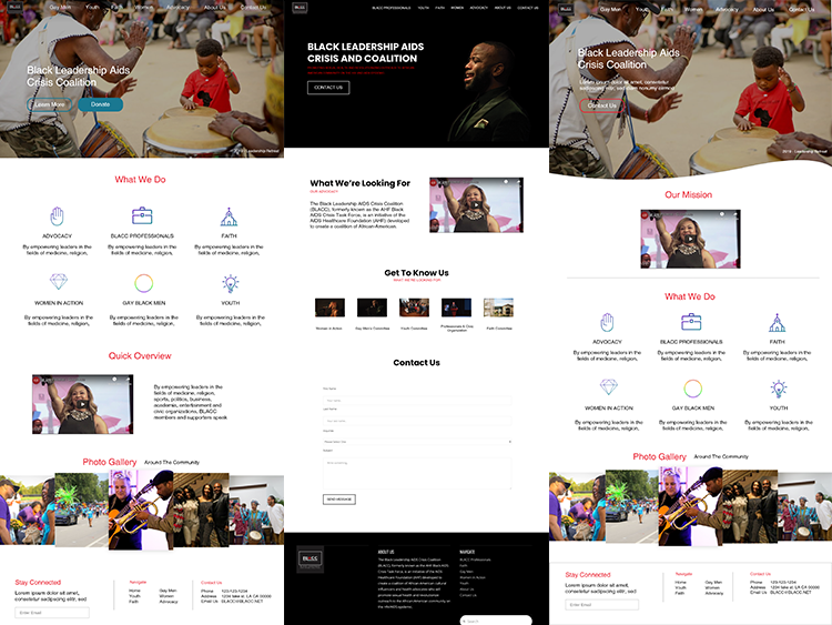
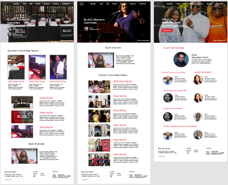
High Fidelity Mock-up
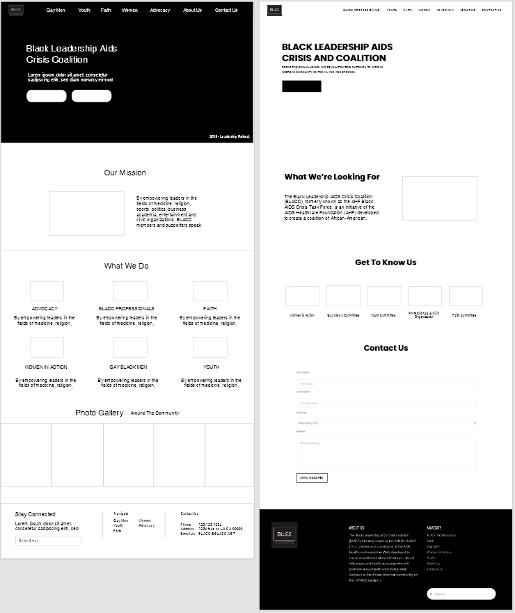
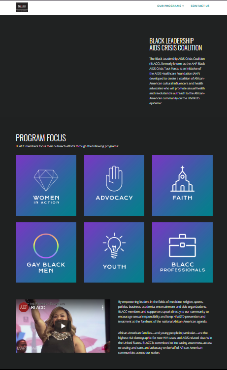
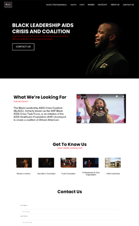
Before vs. After
Here is one before and after screenshot. On the left is a screenshot of the original BLACC's homepage. On the right side is a screenshot of the re-designed homepage.
What I Learned
Three keywords became the major input to our design decisions: Inclusive, Valuable, Encouraging. These words helped design unique features, navigate disagreement on details, overall overhauled the whole website. From font selection and color scheme to picture rules it all matters, but the most important thing during this project was to make clear of having at least some assets made before the building process. By doing this, not only were the clients have more visuals for the website, but also something to work with for future revisions.