
AH! Incident Reporting System.
Timeline
Dec 2020 - Current
Responsibility
UI/UX, Visual Design, Research, Lo/Hi-Fi Prototyping, Usability Testing.
I was the lead UI/UX designer of an ambitious project to create Incident Reporting software, AHI! for WMC
All information in this case study is my own and does not necessarily reflect the views of WMC
My Role
I led the design of the pickup experience between October 2015 and June 2016 and collaborated with two other designers on the Home screen, Search and On Trip features.
In addition, I worked alongside a Researcher, Prototyper, Content Strategist and 2 Product Managers.
I stopped working on the project during the detailed visual design phase as the app started to be built.
The app launched globally on November 2nd, 2016.
Kickoff
Picking up the pieces
At the outset of the project we didn’t have a clear mission or specific goals for the pickup experience. Without pre-existing insights, I partnered with our researcher Shruti to explore how Riders were getting around.
Early Insights from the Field
We tested the existing Uber app with 8 participants in the most problematic pickup areas in San Francisco. Our goals were to understand the challenges Riders and Drivers faced and the workarounds they employed.
Deeper Insights
Working backwards from Perfect
Before I could jump into designing, it was important to define success and understand the health of the pickup experience at scale.
Prior to the redesign, contact rate i.e the rate at which a phone call occurs during the pickup was the only proxy we had used to measure pickup quality.
I unpacked the concept of the perfect pickup and modeled for the dimensions of time, space and anxiety.
I partnered with our data scientist and used this framework to investigate the pickup health around the world.
The start of the why.
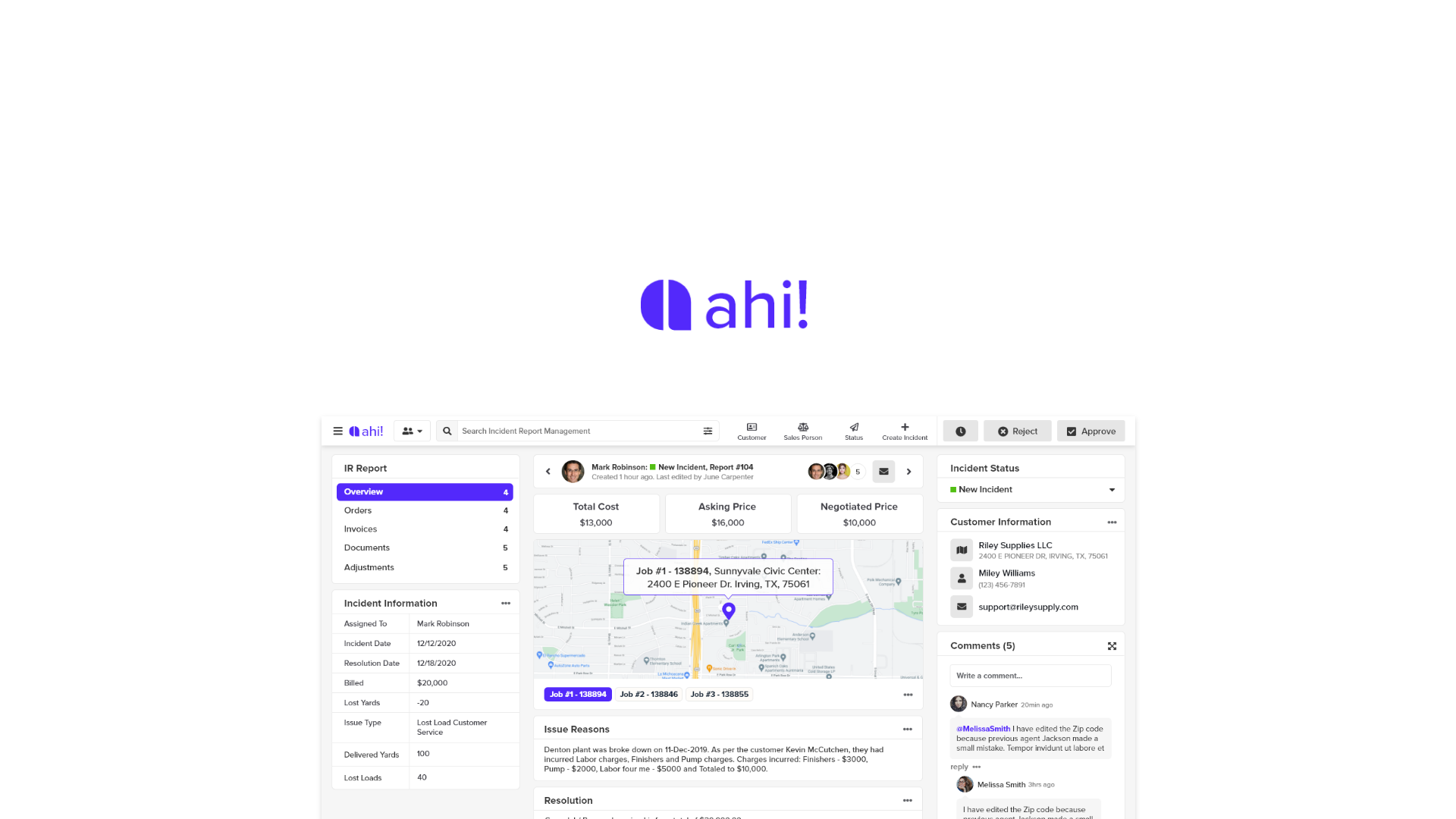
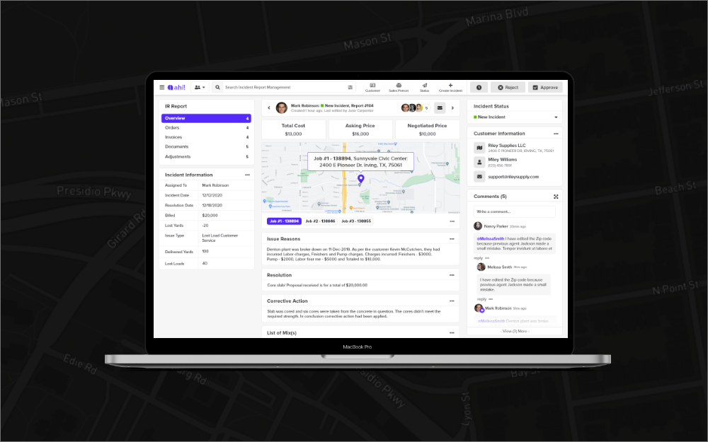
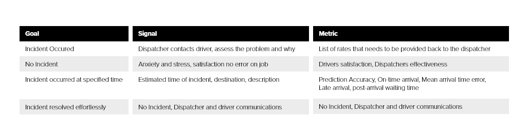
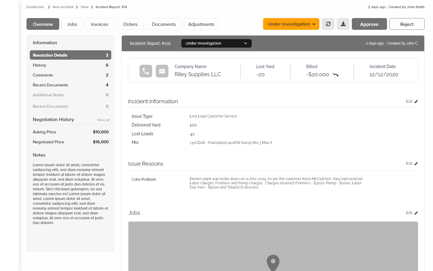
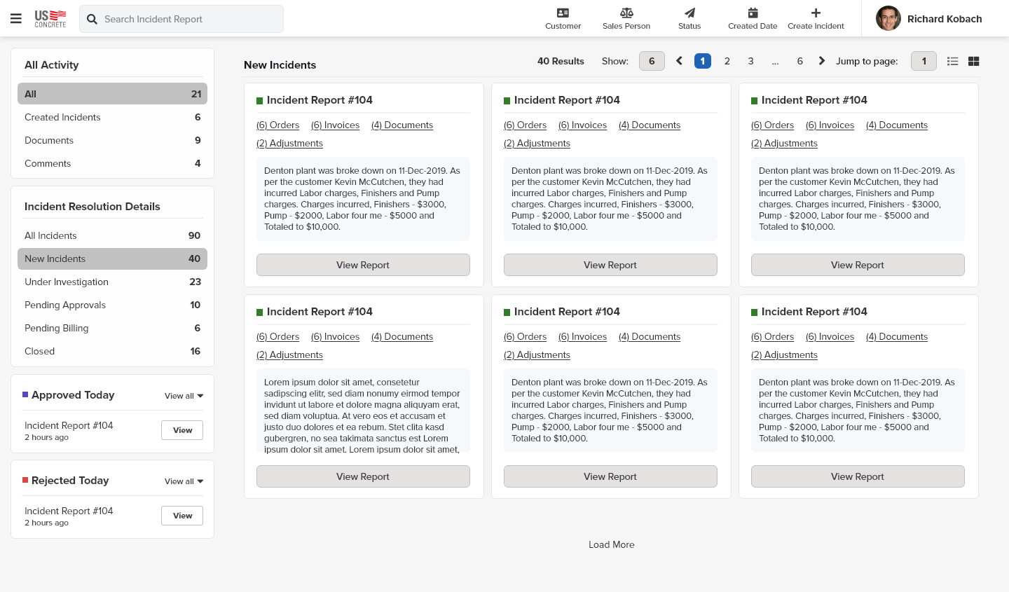
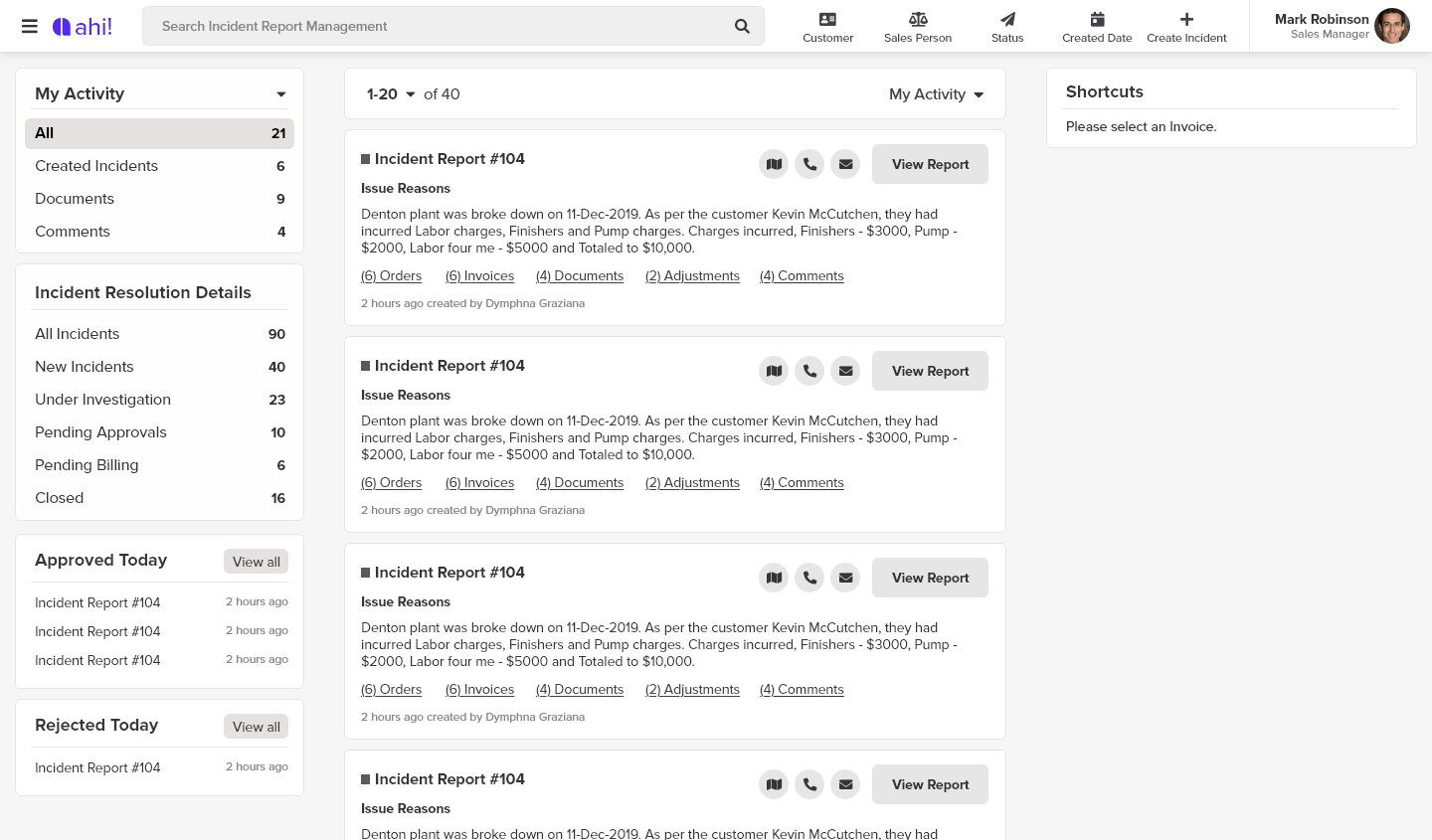
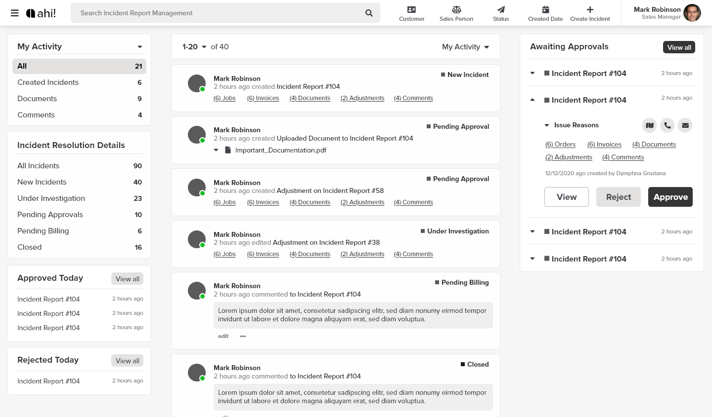
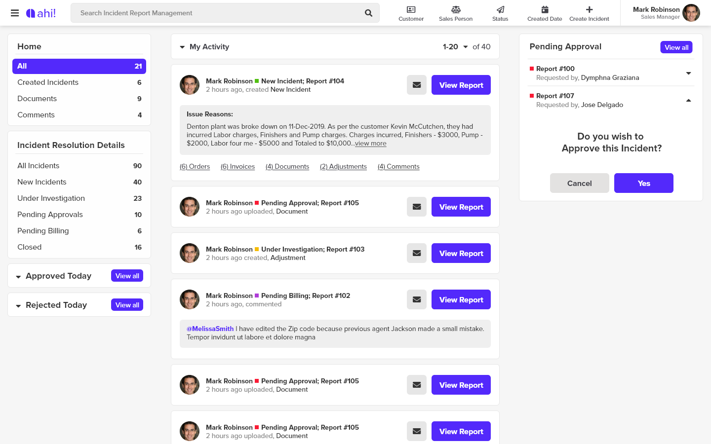
What is the purpose of an incident report?
An incident report is a document used to describe an event. The report may also document the investigation of the event, provide an evaluation of the event and make a recommendation concerning it.
I started doing research regarding the competitor, who they are, and what they do. They had a prior meeting earlier in June.
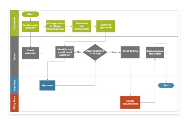
hired me to be the UX/UI to create the next Incident reporting system AHI!
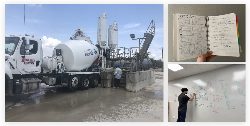
Before starting any wireframes or even a mockup I asked around where I can find more information regarding this application. there was a recorded video of a meeting and that was mostly all the information I had on hand. The manager was very hands-off with the app because there weren’t any bases to start off from. So I created a wireframe to start somewhere.
Whiteboarding wireframes, panning out how I would like the designs to iterate. I wanted to lay out the design before copying over the designs to make it efficent for me and discuss with fellow developers on how my ideas will transition and if it would be a good way
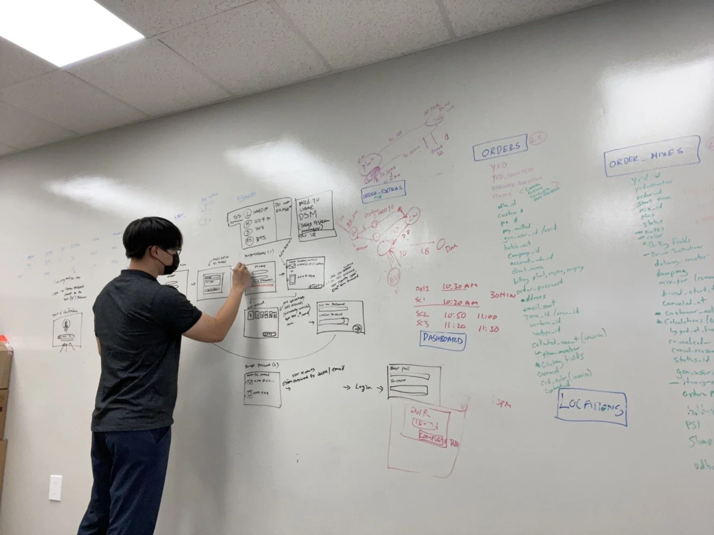
Earlier iteration of the designs before transitioning to a digital space
The first iteration of the design begun.
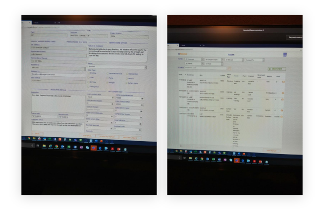
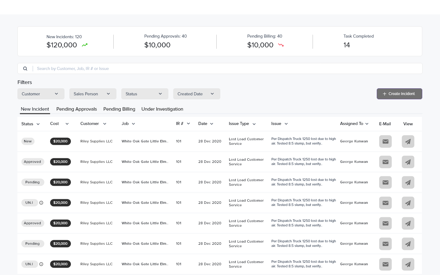
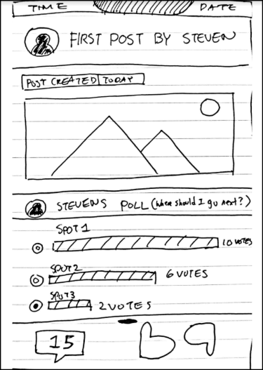
Once the wireframe was finished, I have concluded to start with low fidelity mockup to showcase what I thought was a reasonable start of the project. (Few screens presented here.)
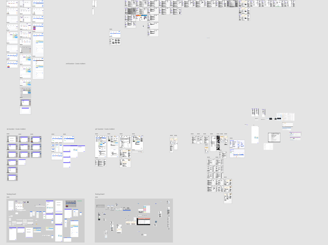
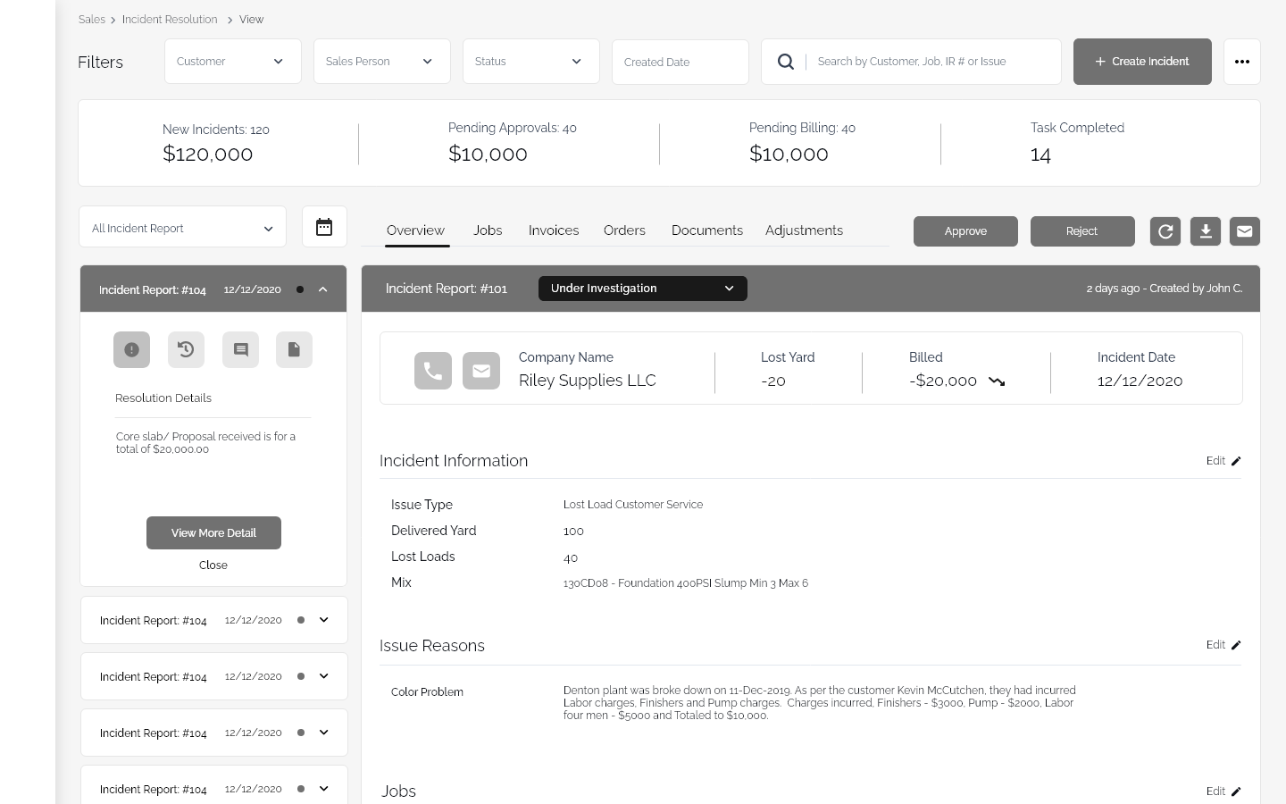
Once everything was layout, I went on to play around with more wireframes in the digital space. 2 weeks sprint to make sure I was getting all the designs ready for review. created a seperate artboard for testing and another for review with the team.
much more cleaner state when presenting to make it easier for me to organize and present to others
I didn’t want to start with just 1 iteration to present. I wanted at least 2 to start our project
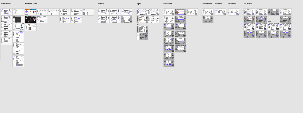
this is where i added more after feedback from business
now there was even more tasks that they wanted once we starting doing more userbility test and focus groups.
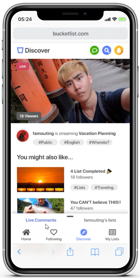
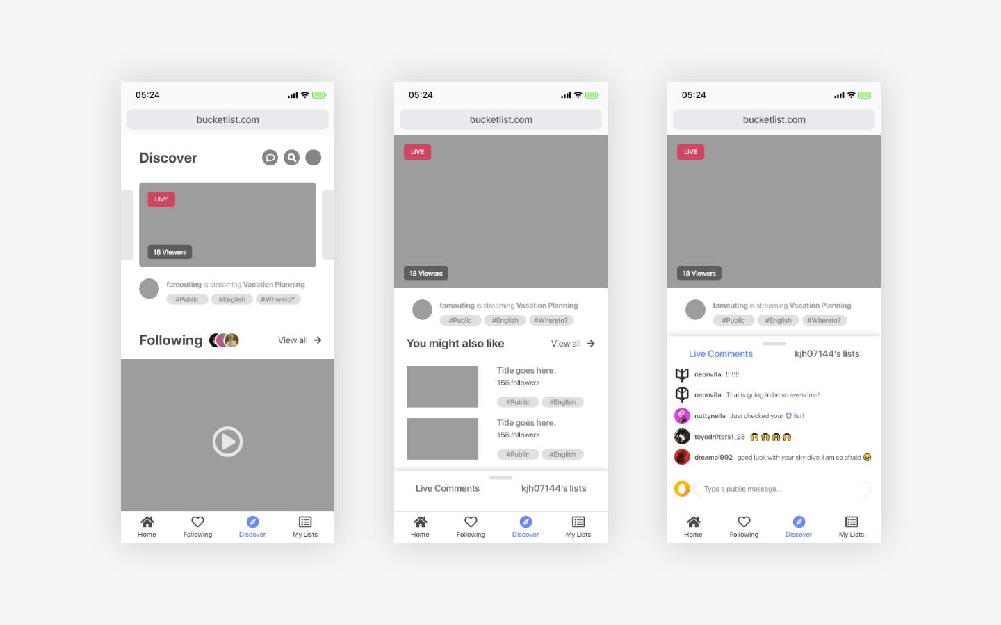
Discover to see what other users are up to.
Watch and share your insight with the host and interact together.
The Process
Exploring the domain, defining the problem, ideating, and refining the solution.
During the 6 month span of the project, I did project management, user research, interviews through online communities, and video chat, and UI and UX designs.
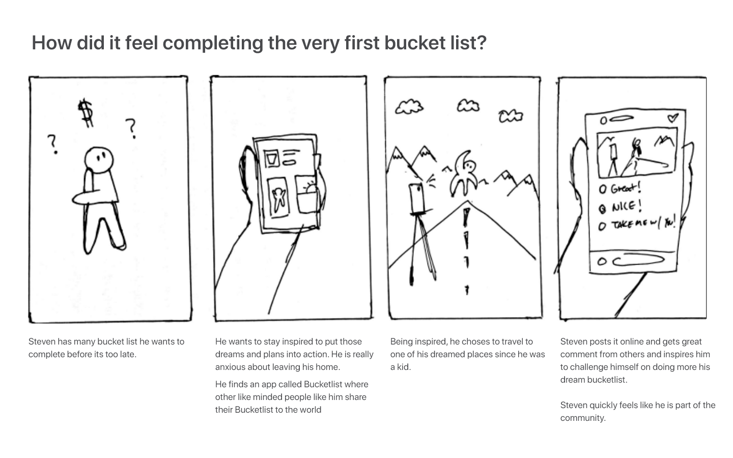
Visiting locations / doing activities to see how fulfilling it is to complete a bucket list.
Exploring…
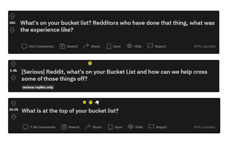
I went into America’s biggest anonymous website. I went to Reddit because of the large communities for each subreddit (over 100k active online users in /AskReddit) I started digital eavesdropping on many other sub-communities to find more information.
Defining the problem.
I synthesized the research through a journey map and chose two key moments to focus on. This helped me form an idea of the key insights around a more specific problem and target demographic for the application.
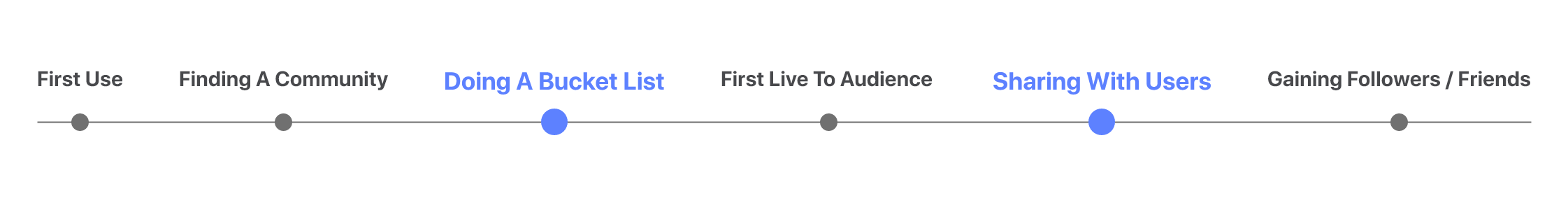
First Use > Finding A Community > Doing A Bucket List > First Live To Audience > Sharing with Users > Gaining Followers / Friends
Many people have second thoughts when added the list to the bucket list.
People write and erase bucket list all the time. It also depends on their age and background environment.Design Decision: The designs should help people join or form communities.
Sometimes people want to keep the bucket list to themselves.
Not everyone is comfortable sharing their own bucket list to the public.Design Decision: The design should give people immediate access to creating lists as well as sharing to public/private.
20 Initial sketches / 5 Storyboards / 3 Feedback Sessions
I narrowed down the concepts first internally, and then by sharing them with our target demographic for feedback and inputs.
From initial sketches to expanded storyboards, I narrowed down the concepts and started some surveys online to decide which aligns best with the design goals. The target demographic allowed me to first verify, what the problems are, and then dive into whether there’s interest in the way the solution resolves it.
I first pursued a concept of “meeting buddies and completing the lists together” which would make doing a bucket list much for fun and efficient.
But then COVID-19 hit the US, and in-person meetings were shut down. I changed my direction by re-focusing on online community building.
Refining the solution.
The concept was the “Twitch for bucket lists” creates online communities, who want to share it to other users around the world.
Live streaming was popular amongst the research participants for its long-form content. This format allowed people to watch and participate in other users’ bucket lists and resonate with similar achievements or goals.
Setting up interviews / RITE ( Rapid Iterative Testing and Evaluation) for feedback.
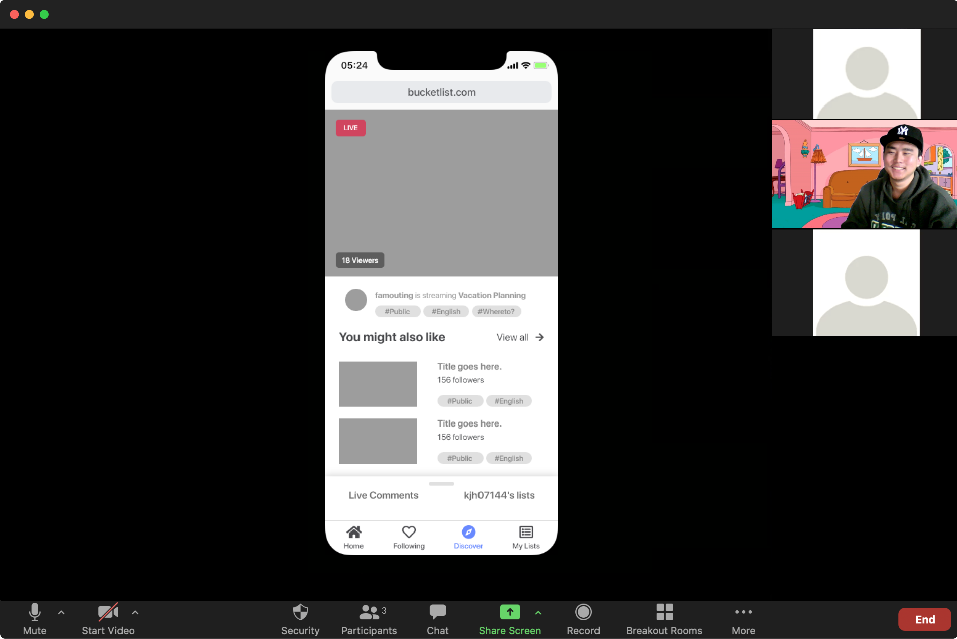
RITE in progress using the rough prototype to gather feedback and future iterations. (Due to privacy, images has been modified)
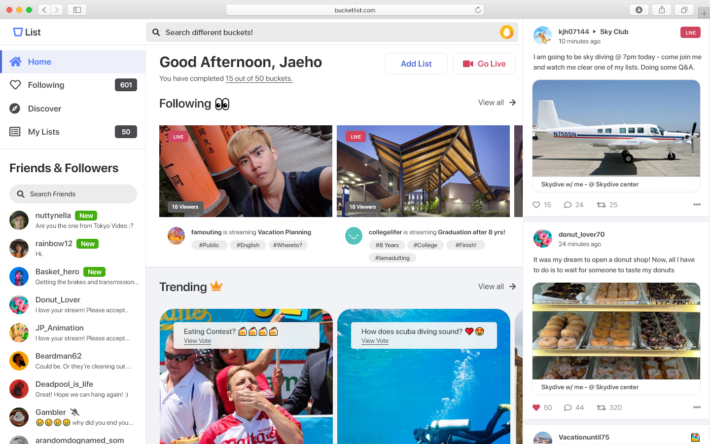
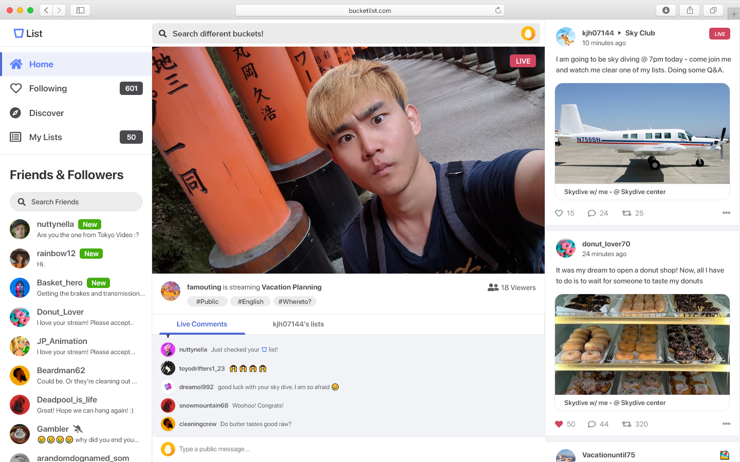
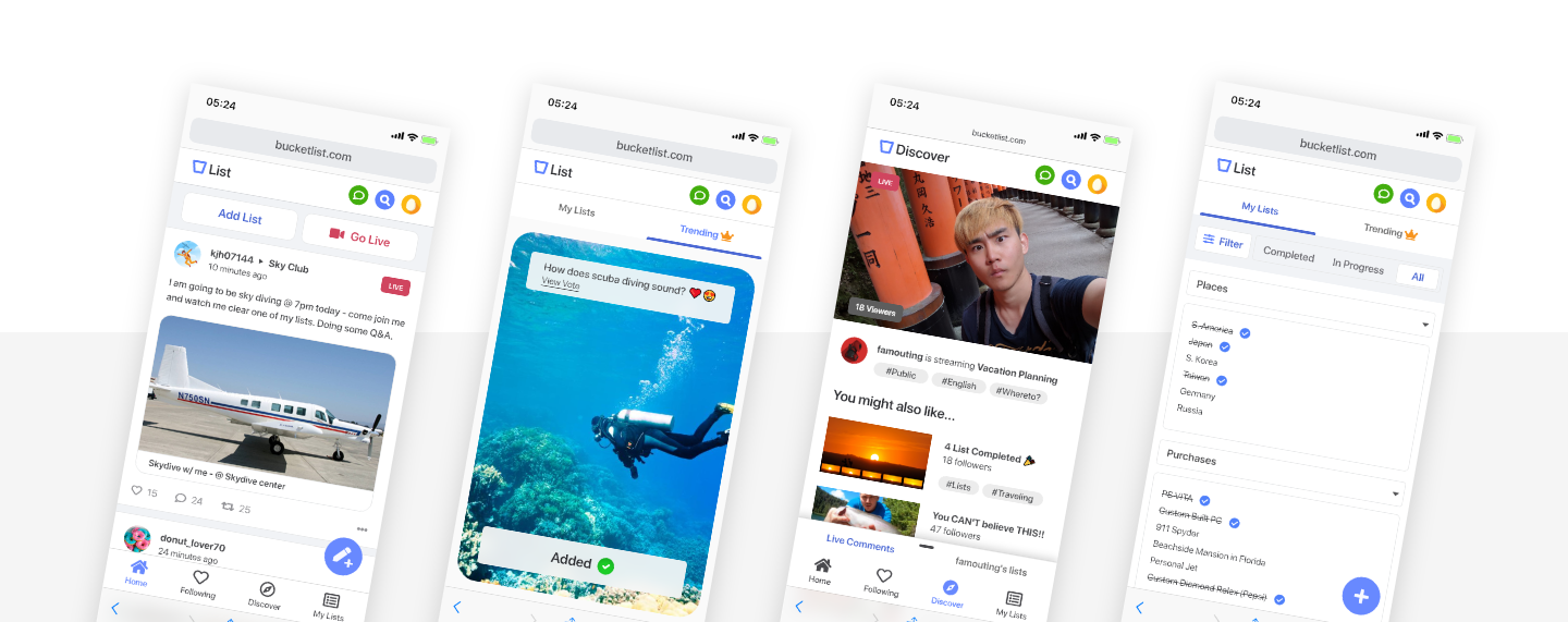
I designed BucketList, a platform that addresses the needs of young adults who wish to fulfill their bucket lists and share them through features including live streaming, posting, and adding bucket list for future goals and dreams.
USER FEEDBACK / NEXT STEPS
“It’s video-based and also intuitive. it also has great interaction, it’s modern, it has a balance of public and private - Would like this application to become reality.”
- Anonymous research participant.
This experience taught me how I can conduct user interviews and receive constructive criticism from people of different ages/backgrounds and most importantly how it is important to keep track of time responsibility.
This project made me much more alert when being organized. Color coding with dates and priorities making sure to have enough time when presenting and leaving enough time for others. Lastly, I learned that design should be leveraged as a tool that can benefit people and their lifestyles. 🤗
Next Steps
Explore design options for other platforms devices
Continue to iterate and validate my design through testing, and strive for constant improvements
Explore new design opportunities to integrate more interactive features