Disclaimer: This case study is still being worked on. Not a Final Design
Crunchyroll Website / Mobile redesign ( In Progress )
🖊️ My Role: UI Designer
I created a UI design which has dark mode and navigation to make it more suitable for users to watch and read in a more simple manner.
The design was all done by myself. I wanted to explore current trends as well as improve my design skills.
About the Company
“Crunchyroll is a company focused on streaming anime, manga, and drama.”
Current Live Crunchyroll website: Can be viewed here.
Changes I want to make:
Easier experience for users to browse the website by making it more engaging.
Making the brand push its focus more towards the competitors such as Netflix, Hulu, Amazon, etc...
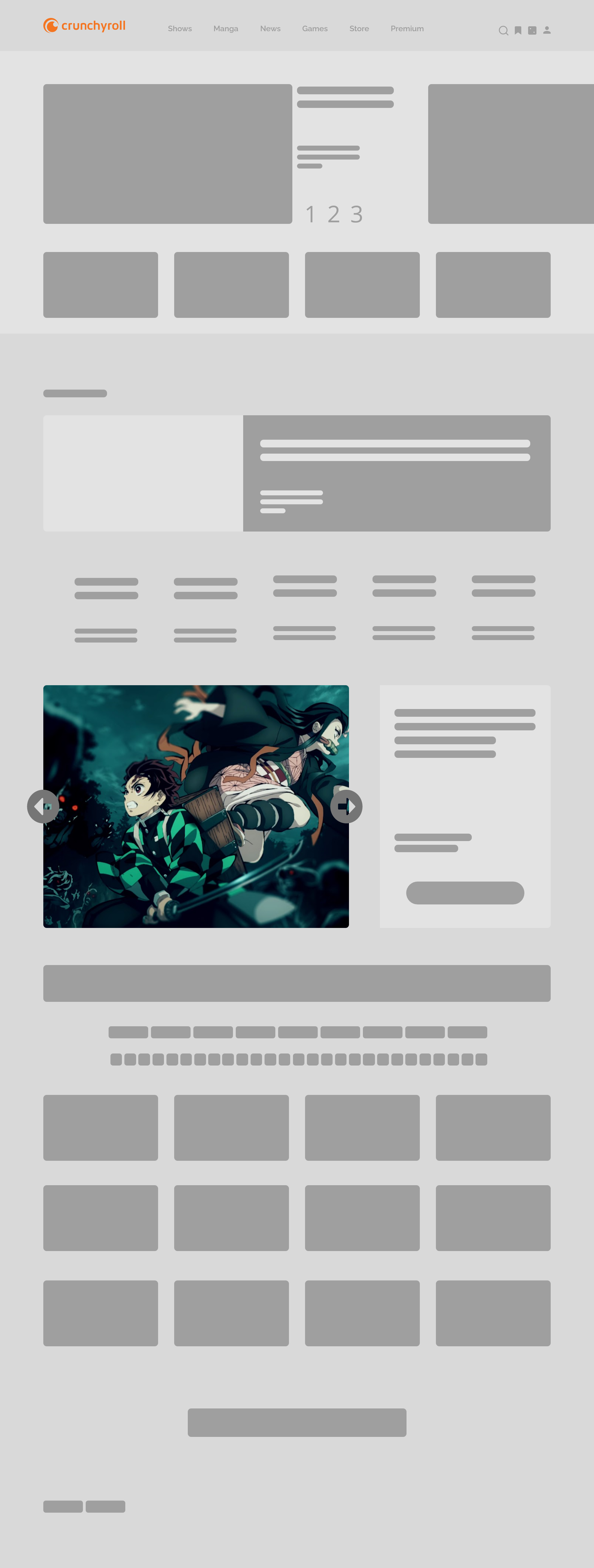
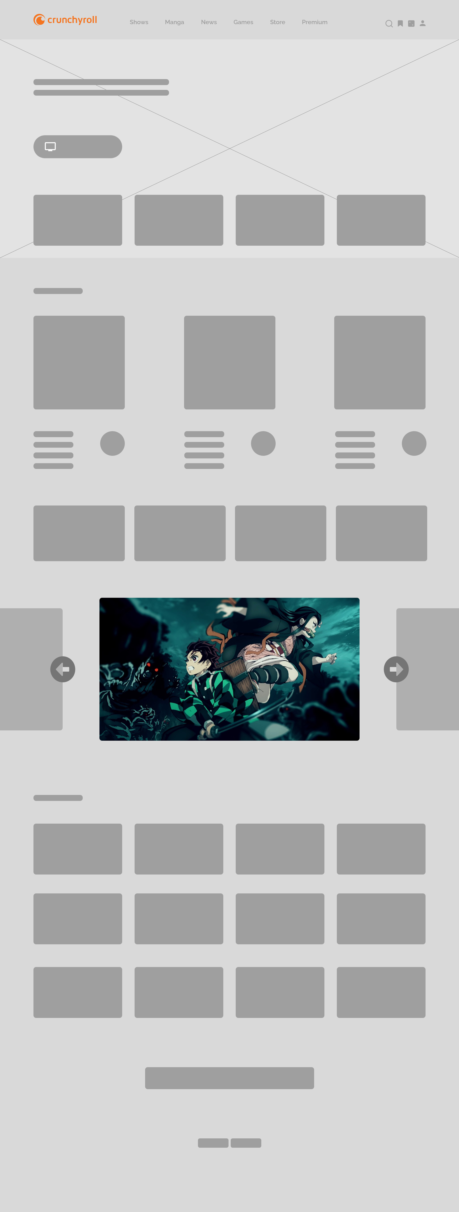
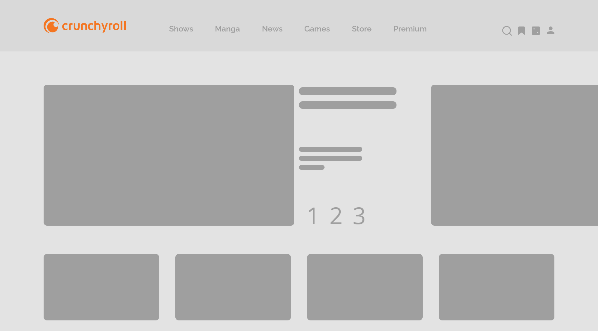
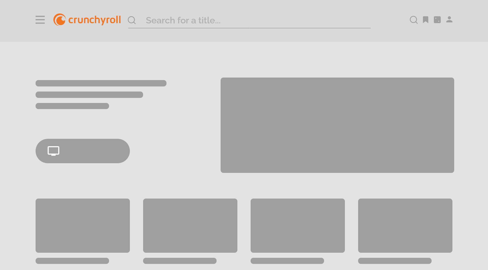
Landing Page Wireframes
Started the design with low-fi wireframe and a touch of mid-fi/high-fi to understand the correct concept I wanted to explore.
Type - 1
Type - 2
Type - 3
Type - Its over 9000!!!
Scheduled Wireframes
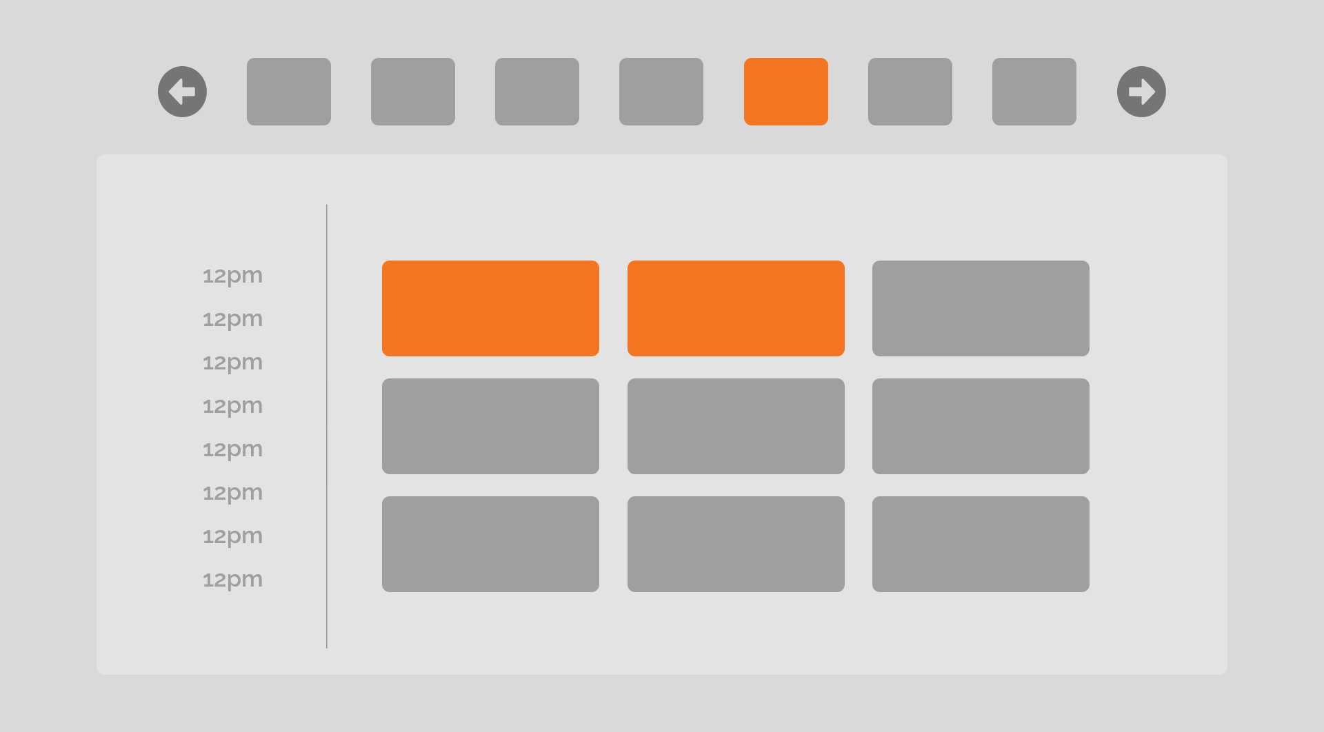
Grid view
Accordion style
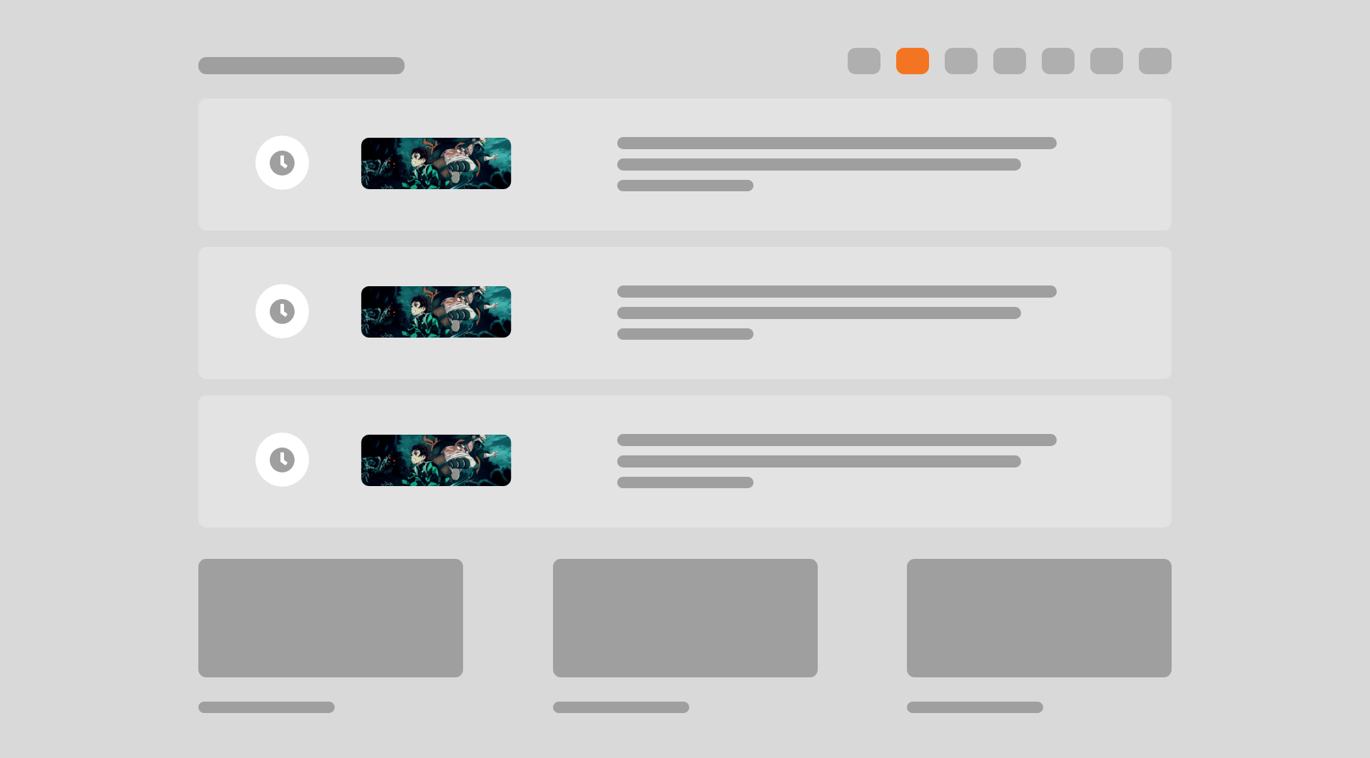
Videos page Wireframes
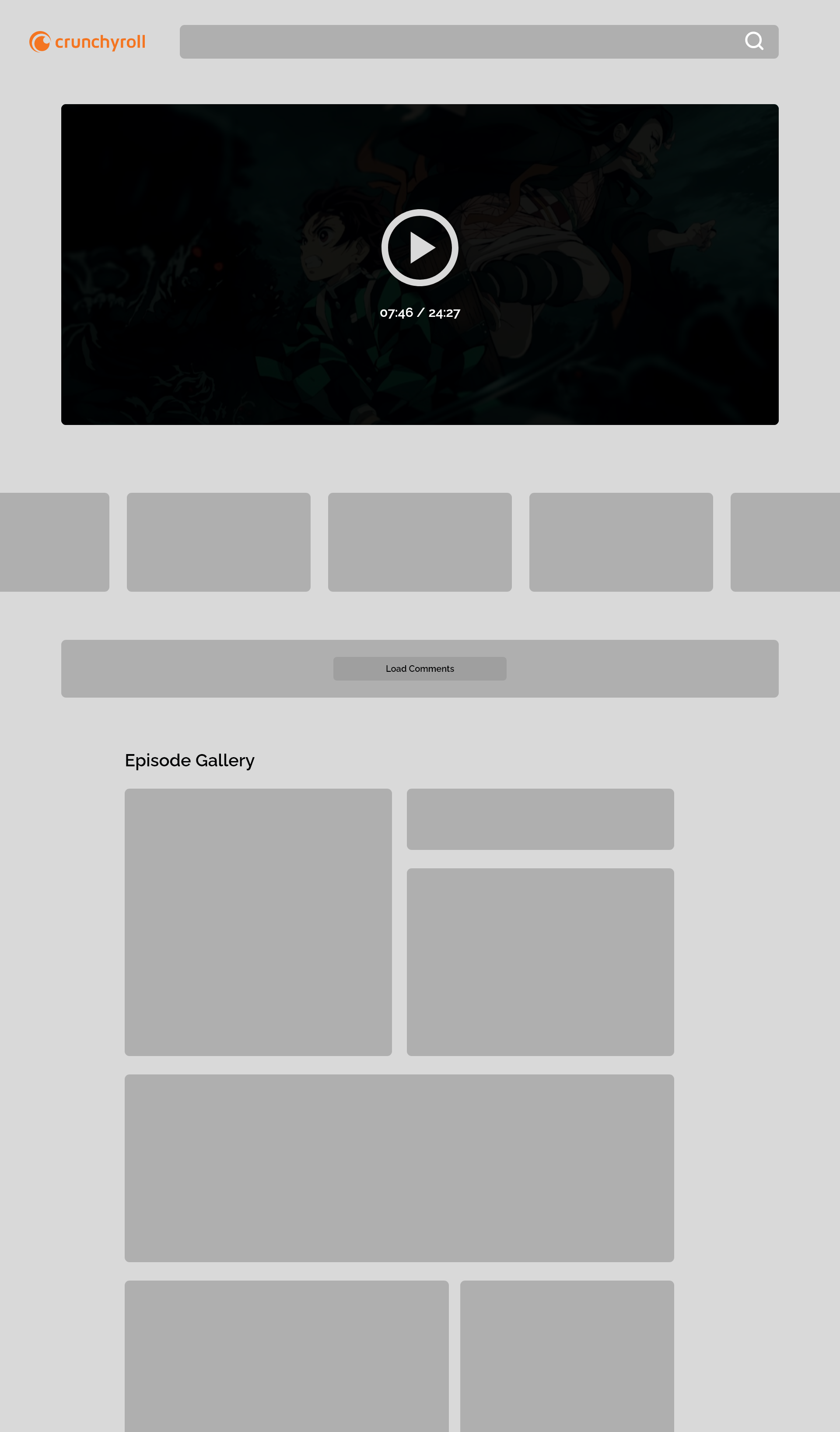
Episode listing with Carousel
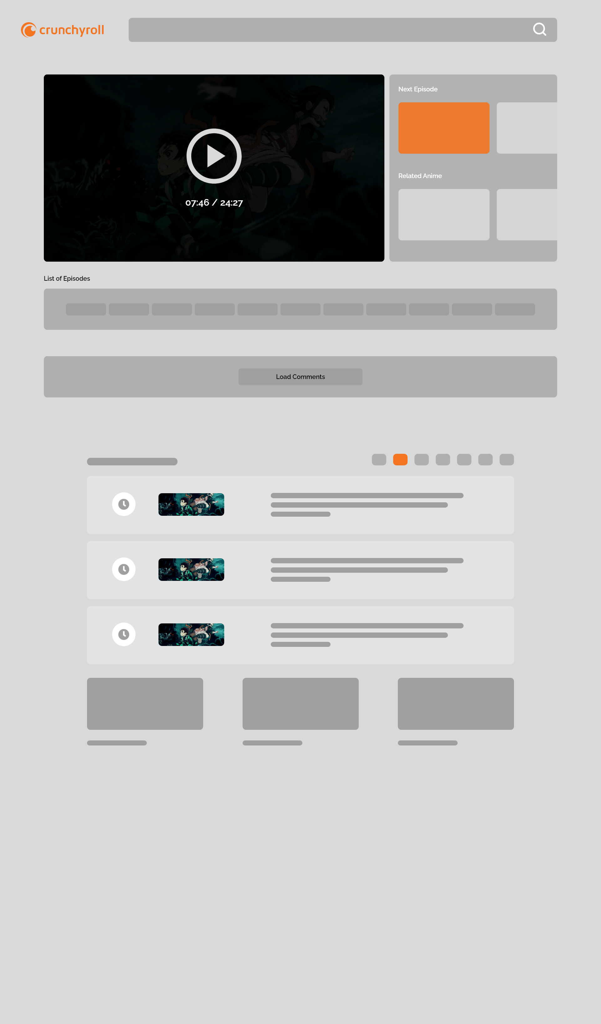
Carousel video v.2
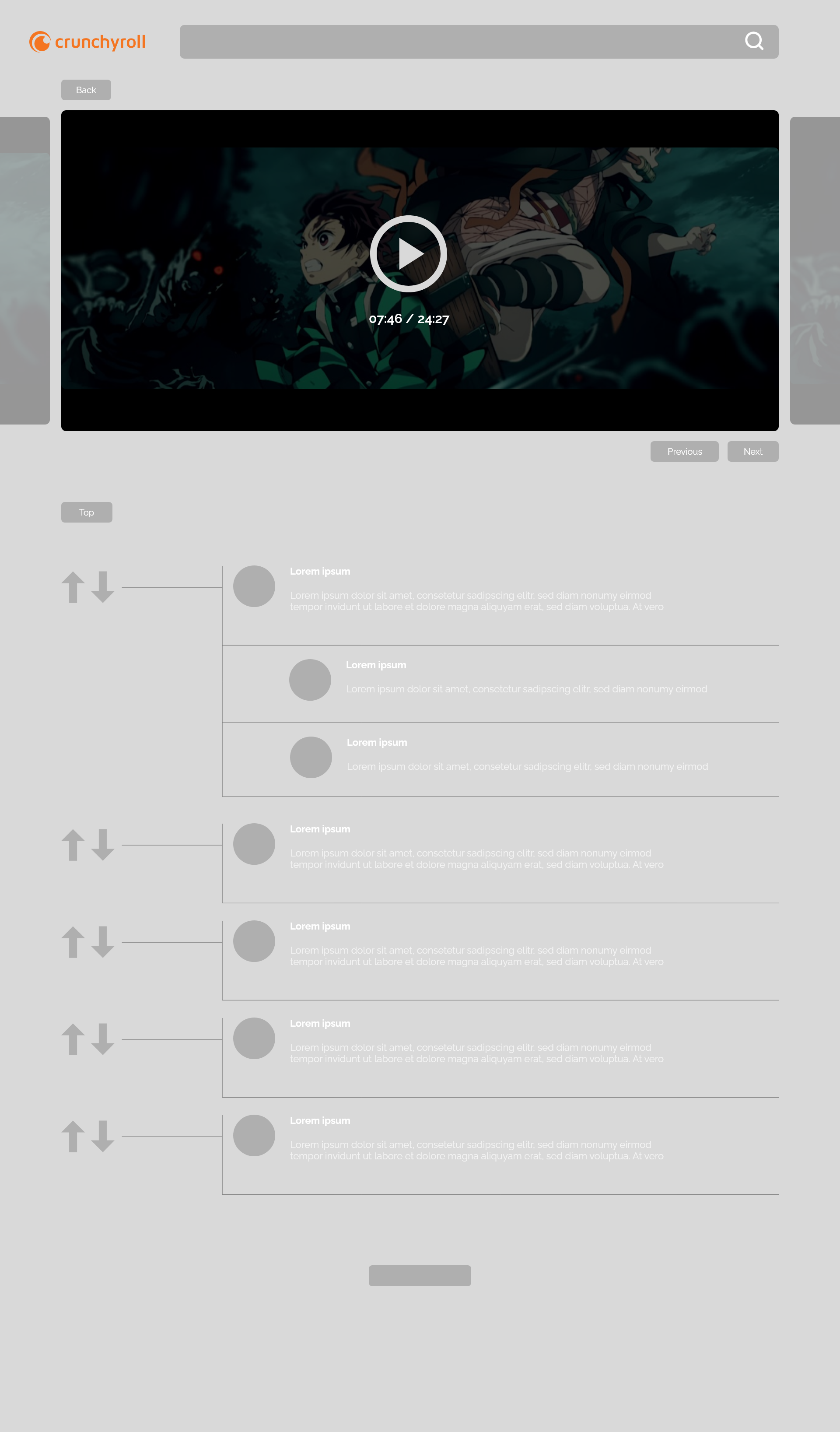
Listings
Collapsed comments
Visual Style Guide
Let there be light!
Positive contrast polarity (light mode) refers to dark-font text on light background.
Negative contrast polarity (dark mode) denotes the combination of light (e.g., white) text on dark (e.g., black) background.
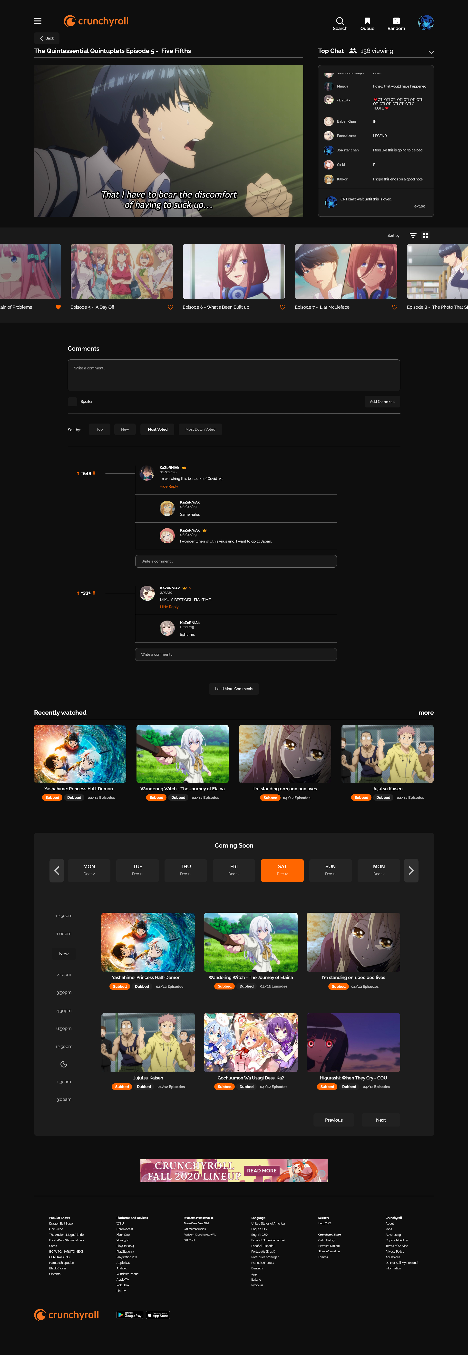
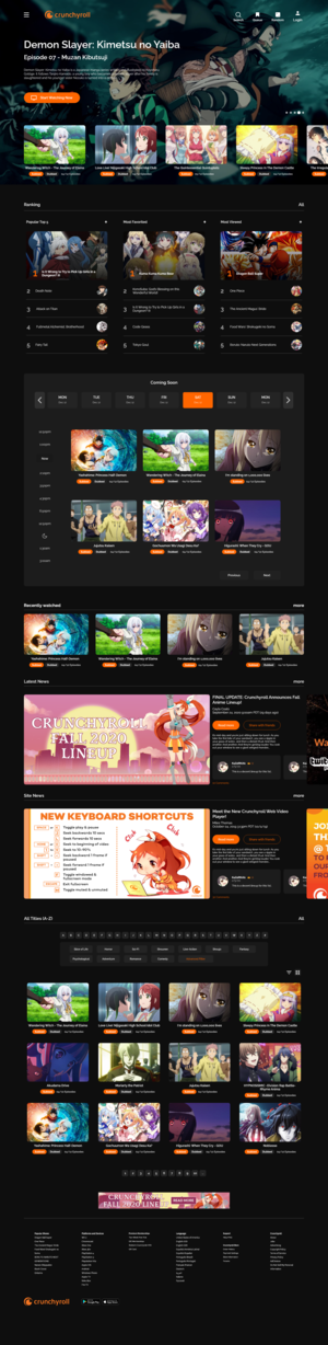
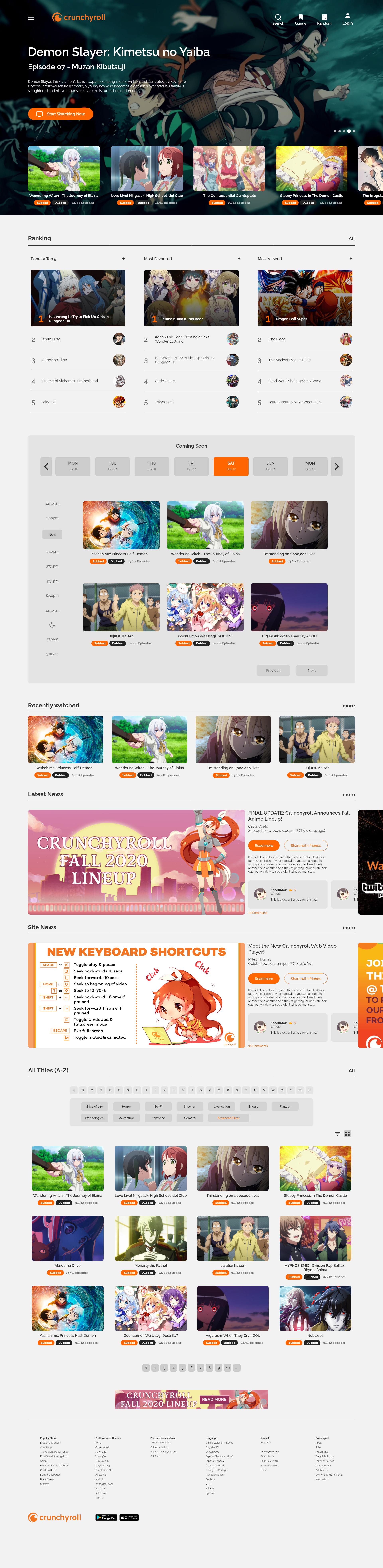
↓First iteration of the redesigned Crunchyroll website.
Side by side comparison
The human pupil is the gateway to the retina: through it, light reaches the eye. By default, the human pupil changes size depending on the amount of light in the environment: when there is a lot of light, it contracts and becomes narrower, and when it’s dark, it dilates to allow more light to get in.
I want to make sure I am giving an option to where what the users prefer than having one in permanent.